Stock Peer Analysis Viewer using Streamlit & Altair
During my co-op at RBC in Liquidity Management & Parameters, I discovered Streamlit, a python package that enables the visualization of data into a streamlined modular process. I ended up building a stock ticker visualizer with it, and wrote about it [link].
Streamlit is an open source app framework that allows you to connect your back end to a front end that is built entirely by python code. That means that a lot of tasks (like say creating a chart, or creating a button) are modular; invoke the class and place your arguments, and Streamlit automatically compiles it to your localhost browser.
Altair fits that same philosophy. It is a declarative statistical visualization library, instead of imperatively drawing every line and axis, you describe the data and the encodings you want, and Altair compiles it into an interactive chart. Combined with Streamlit's built-in st.altair_chart, charts feel as plug-and-play as the rest of the UI.
Due to the time constraints I am on, I won't show any code or pseudo-code in this post. Feel free to check out my code over at my GitHub here: [link]
Instead, I will be showing screenshots of the web app and what they do:
Dashboard Sidebar
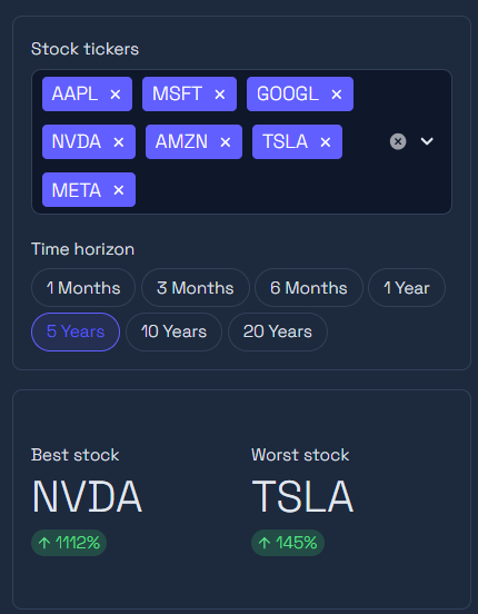
In here, you can access the 'Stock tickers' drop-box. You can pick from a list of ~90 tickers, or type in any new ticker and it will automatically connect and load from yfinance.
You can choose the time horizon, ranging from 1 Month to 20 Years.
Below the sidebar, the app also calls out the best stock and worst stock of your selection, based on each ticker's normalized return over the period.
One quality-of-life feature I'm particularly happy with: your ticker selection is saved to the URL as a query parameter. If you build a comparison you like, you can copy the link, send it to someone, and they'll land on the exact same peer group.
Because of caching, if you load the 1 month data, then go to the 3 month data, it will only need to extract month 2 and 3, since month 1 already exists. This ensures that the app is quick and responsive. I've also added handling for yfinance's rate limits, if we get throttled, the app warns you and clears the bad cache entry instead of crashing.
Normalized price chart
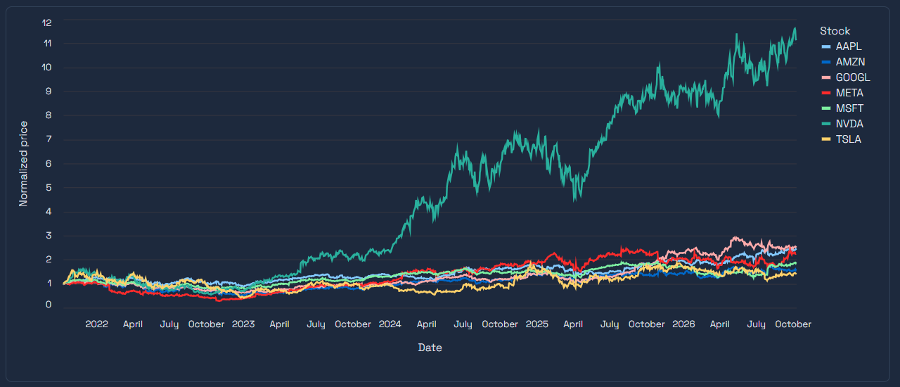
Here, you can view the tickers you have selected, but instead of raw prices, everything is normalized to start at 1. This puts all stocks on the same footing regardless of share price, so the chart shows actual relative performance over the horizon you picked.
Individual stocks vs peer average
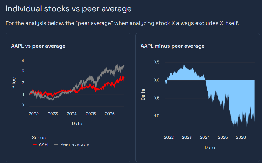
For each ticker in your list, you get two charts:
- {Ticker} vs peer average — the stock in red against the average of its peers in gray. A key detail: the peer average excludes the stock itself, so it's always a true apples-to-apples comparison rather than the stock being averaged in with its own benchmark.
- {Ticker} minus peer average — an area chart of the gap between them, so you can see exactly when the stock pulled ahead or fell behind, and by how much.
Raw data
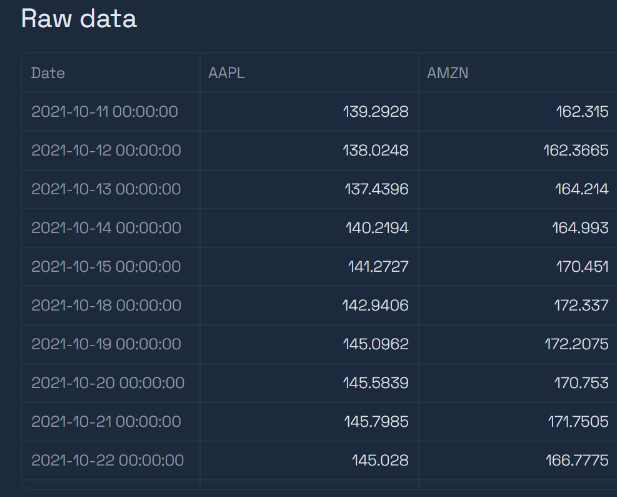
For anyone who wants to verify the numbers, the underlying close-price data is printed at the bottom of the page.
Conclusions
Being able to utilize streamlit to not have to use any other programming language to display information is a game changer for me. I like using python because of its rapid ability to create scripts, and having the UI element be modular plug and play makes this all the more easier. Altair extends that to the charts themselves, reshaping the data and describing the encodings was all it took to go from raw prices to a full peer-comparison view.
As always, the code can be found here: [link]