Curve Fitting with Bayesian Ridge Regression - Quick Tutorial
Looking into a more complex application of Ridge Regression that shows the power of curve fitting.
Bayesian regression techniques can be used to include regularization parameters (like alpha in the previous post) in the estimation procedure: the regularization parameter is not set in a hard sense but tuned to the data at hand.
Bayesian Ridge Regression
Bayesian regression treats regularization parameters as learnable random variables rather than fixed manual settings. By placing 'uninformative' priors on parameters (like lambda for coefficient precision and alpha for noise precision), the model automatically adapts these values to fit the specific dataset during estimation.
To obtain a fully probabilistic model, the output y is assumed to be a Gaussian distributed around alpha where it is again treated as a random variable that is to be estimated from the data.
This is the equation, given probability y and coefficient alpha:
p(y | X, w, α) = 𝒩(y | Xw, α^−1)Advantages/Disadvantages
The advantages of Bayesian Regression are:
- It adapts to the data at hand.
- It can be used to include regularization parameters in the estimation procedure.
The disadvantages of Bayesian regression include:
- Inference of the model can be time consuming.
1 - Define sin function
Define sine wave function: sin(2πx)2 - Generate training data
Generate 25 random x values between 0 and 1
Calculate true y values using sine function
Add Gaussian noise (scale 0.1) to create observations
3 - Generate test data
Create dense grid of 100 points from 0 to 14 - Transformation
Transform both train and test x values into polynomial features (degree 3)5 - Initialize model
Create Bayesian Ridge regressor
Enable log marginal likelihood computation
6 - Compare initializations (in loop)
For each plot (left and right):
    If first plot:
        Use default initialization values
    If second plot:
        Use custom initialization (smaller lambda)

    Fit model on training data
    Predict on test data (return mean and standard deviation)
7 - Plot & display
Draw blue line showing true sine curve
Scatter plot of noisy training points
Draw red line showing predicted mean
Fill pink shaded area showing uncertainty (mean ± std dev)
Set y-axis limits
Add legend

Display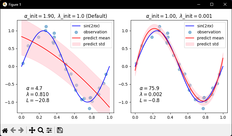
Conclusion
Dealing with ways of curve fitting is as much of an art as it is a science. There are a lot of factors that can be used as a guiding hand to which model might be best. For example, time constraints, data constraints, reliability of data and so many more.
The task of these tutorials is to increase the number of tools to be able to identify what the current problem at hand requires.
Will be continuing on this journey if covering related topics to becoming a quant.
As always, my Python code for this tutorial can be found over at my GitHub: https://github.com/MyQuantJourney/MyQuantJourney.git